Author: Nona Spas
As LinkedIn moves toward its next major algorithm update, the platform is introducing a significant visual shift that directly impacts one of its most popular content formats: the document (carousel).
Here is an analysis of this update and what it means for your content strategy.
Small Screen, Big Impact: LinkedIn’s New Document Display Strategy
For years, the LinkedIn document was the “real estate king” of the mobile feed. By uploading a PDF document, creators could occupy almost the entire vertical screen, forcing users to engage or scroll past a massive block of content.
That is changing.
LinkedIn has begun rolling out a new interface for this format on mobile devices that fundamentally alters how users consume “swipeable” content. If you’ve noticed your document posts looking a bit “cramped” lately, you aren’t alone.
The Shrinking Document: Function vs. Legibility
The most immediate change is the scale. Previously, documents spread across nearly the entire width and a significant portion of the height of the mobile feed. Now, they appear at roughly half their original size.
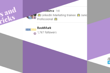
Source: Screenshots of Feld and Anthony Blatner publications
It is important to note that the core functionality hasn’t changed: you can still slide through the carousel directly in your feed. However, the experience is now a “look but don’t read” affair.
- The Legibility Gap: While you can swipe through every page, the text is now so miniaturized that it is barely readable without squinting.
- A New Visual Obstacle: Adding to the clutter, there is now a constant black rectangle spanning the length of the document title that covers the very top of your first slide, further obscuring your design.
- The “Double Click” Barrier: To actually digest the information, users must now click to expand the document to full-screen. This extra step introduces friction; if the first slide doesn’t grab them, they are likely to swipe past rather than click to enlarge.
The “Scroll-By” Risk: Because the format is smaller, it no longer dominates the visual field. Users can now easily bypass a document as it looks relatively minor compared to high-resolution single images or video posts.
The Silver Lining: Desktop and UI Cleanup
It’s not all bad news for document lovers. While mobile is seeing a squeeze, the desktop version remains unchanged, maintaining its large-scale display for professional browsing.
Additionally, LinkedIn has refined the “frame” of the document. The popup lines—which traditionally showed the document title and page numbers—have been moved outside the main dimensions of the visualisation. While the desktop version now offers a cleaner, wider “safe area” for your design, the mobile experience tells a different story; since the document is now partially obscured by a constant black box containing the title and page numbers, you still must avoid placing any critical information at the very top of your slides. Furthermore, LinkedIn is leaning into a “modern feel” by adding rounded corners to the document container, aligning the aesthetic with the updated design language seen across the rest of the platform.
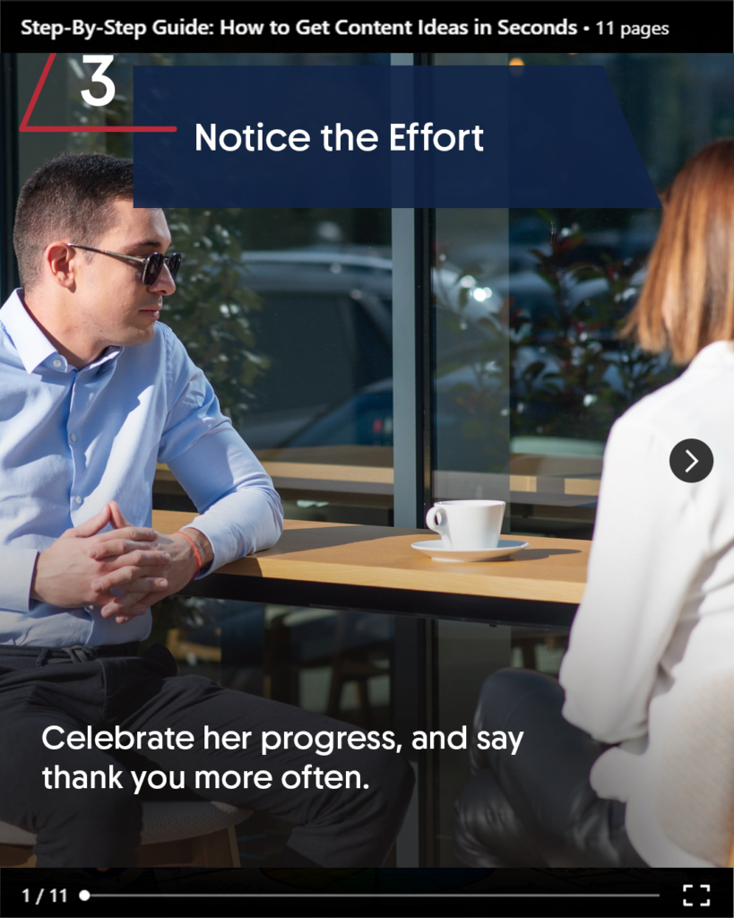
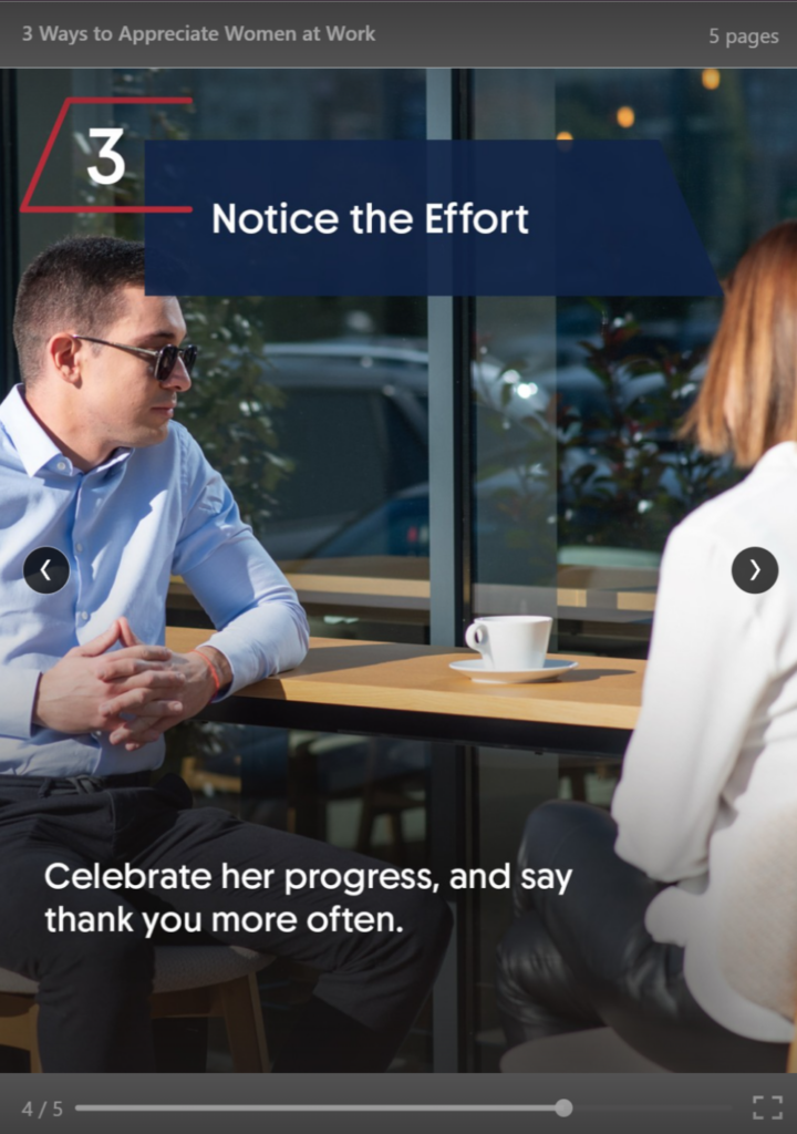
Source: Personal Screenshot of Old vs New Document Visualisation
The Strategic Shift: Advantage Single Image?
This update creates an unexpected winner: the Single Image post. While documents are being shrunk into “preview boxes,” single images continue to appear at their full uploaded aspect ratio. If your goal is to stop the scroll with a high-impact visual or a bold statement, a single, well-designed image may now offer better “thumb-stop” potential than a multi-page document that requires an extra click to read.
How to Adapt for the 2026 Algorithm
As LinkedIn prepares for its next algorithm shift, “Signal Strength” and “Clarity” are becoming the primary metrics. To keep your documents performing, consider these three adjustments:
- The “Big Font” Rule: Design your slides as if they will be read on a postage stamp. Increase your minimum font size by at least 20%.
- Contrast is Key: Use high-contrast backgrounds to ensure the “shrunk” version is still visually striking.
- The Hook Must Be Huge: Since the preview is smaller, your first slide must have a headline so bold it’s legible even at 50% scale.
The Linked Blog is here to help you navigate these interface shifts. As the algorithm continues to evolve, the brands that adapt their visual “real estate” strategy will be the ones that stay visible.
LinkedIn’s algorit
The Linked Blog is here to help you navigate these interface shifts. As the algorithm continues to evolve, the brands that adapt their visual “real estate” strategy will be the ones that stay visible. See more about what we can do for you here.